Registration Overview
Giving event planners a clear picture of their registration setup so they can launch with confidence.
Context
Cvent's registration system is one of the most foundational parts of the platform — it's the first touchpoint between an event and its attendees, and it has to serve a wide range of event types, from simple webinars to multi-day conferences with complex pricing and access rules.
I partnered with Siqi Wei, a Principal Product Designer, to redesign the registration setup and management experience. After Siqi secured leadership buy-in for the vision, we worked closely to bring it to life. Siqi led the strategic direction, and we collaborated on flows and screens. My focus was on designing core registration setup features — creating registration assets, surfacing build status, and guiding first-time users.
Problem
Setting up event registration was fragmented, confusing, and hard to verify.
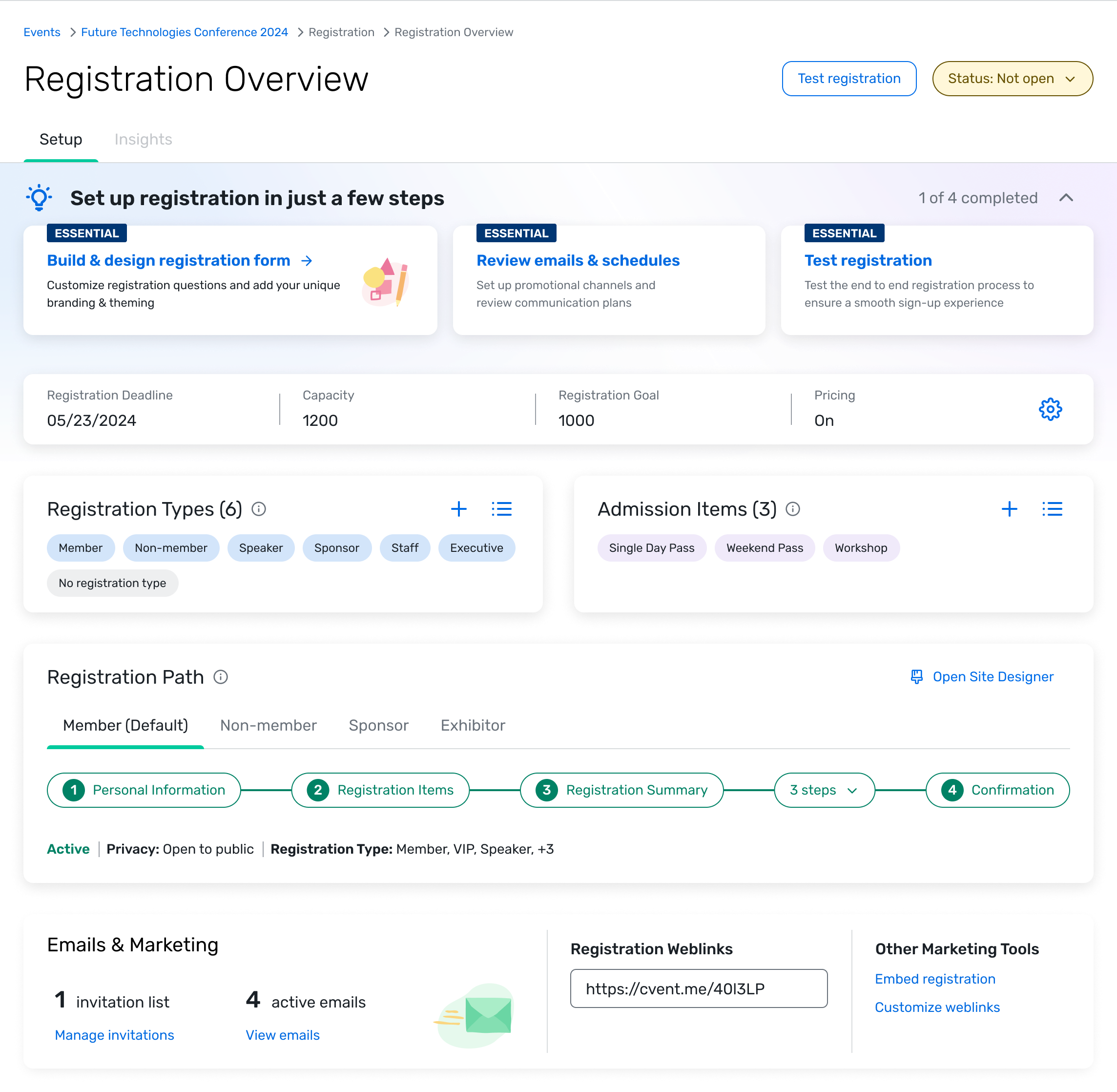
Registration is the most foundational feature in event planning — it's the first experience attendees have with an event, and it determines whether planners collect the data they need to deliver everything else. But the existing setup workflow was spread across multiple pages with no way to see the big picture. Planners couldn't easily tell whether their registration was configured correctly without tediously testing the experience themselves. They needed a way to understand their build progress at a glance and know what to work on next.
Approach
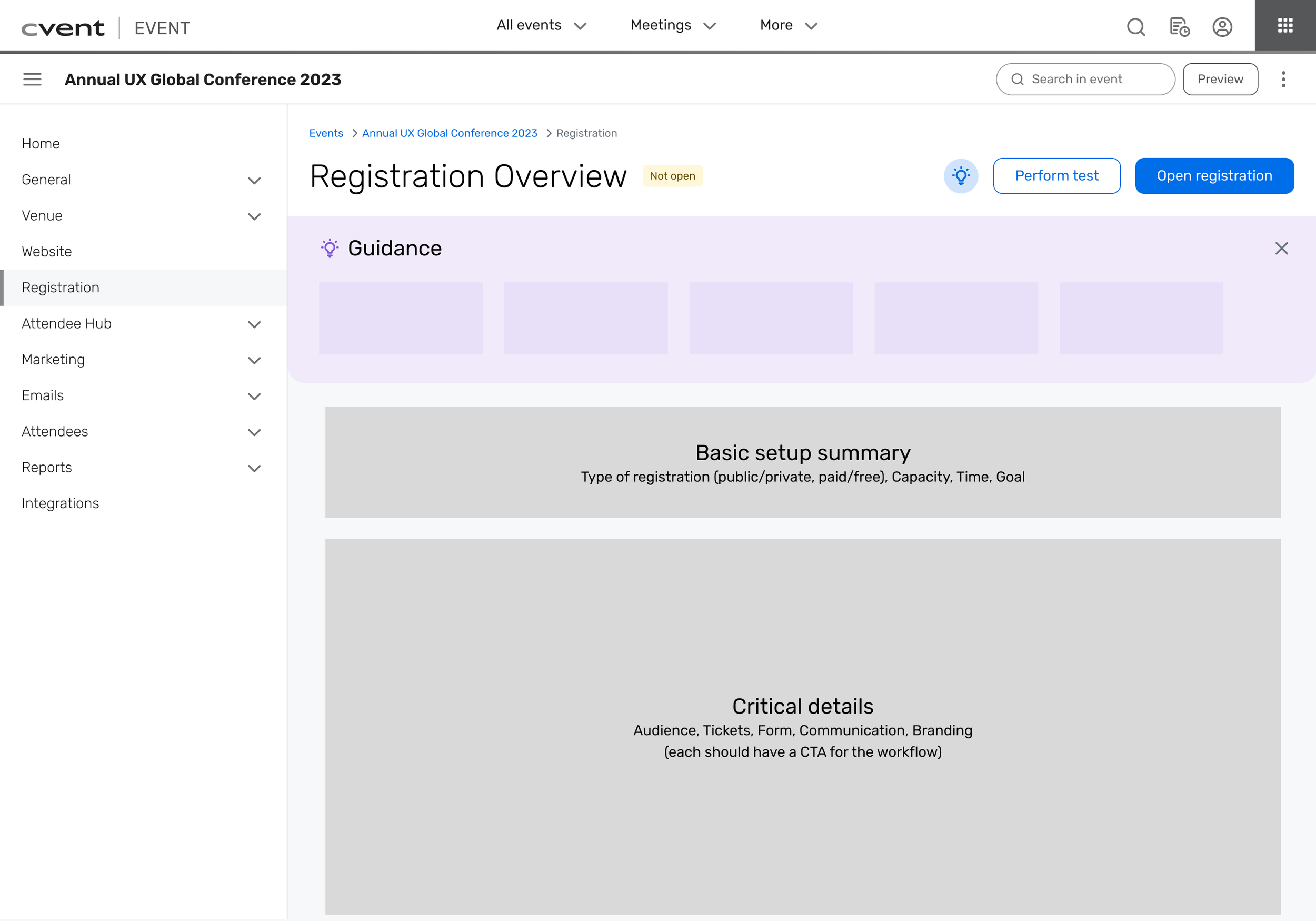
I took a content-first approach, working with a content designer to identify the essential information planners need to see during registration setup. Starting with content rather than UI let us iterate quickly on hierarchy and structure — we could test whether the right information was surfaced before committing to any specific layout or interaction pattern. Site-mapping helped us see the full picture of how registration workflows connected and where the fragmentation was worst.
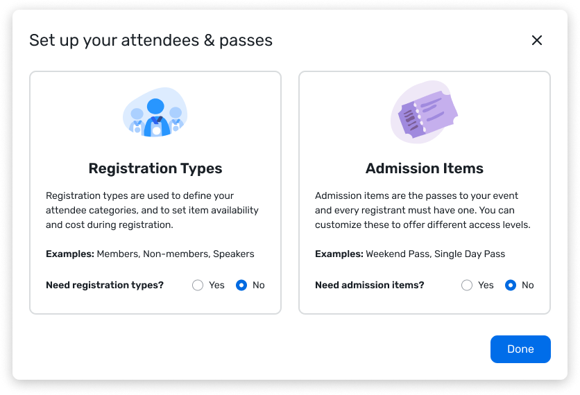
We also made an early scoping decision that shaped the whole project: build for free, public events first, and leave pricing and privacy controls for future releases. Registration for paid or restricted events introduces a lot of additional complexity, and trying to solve everything at once would have slowed us down without improving the core experience. Starting simple gave us a foundation we could extend.
Solution Details

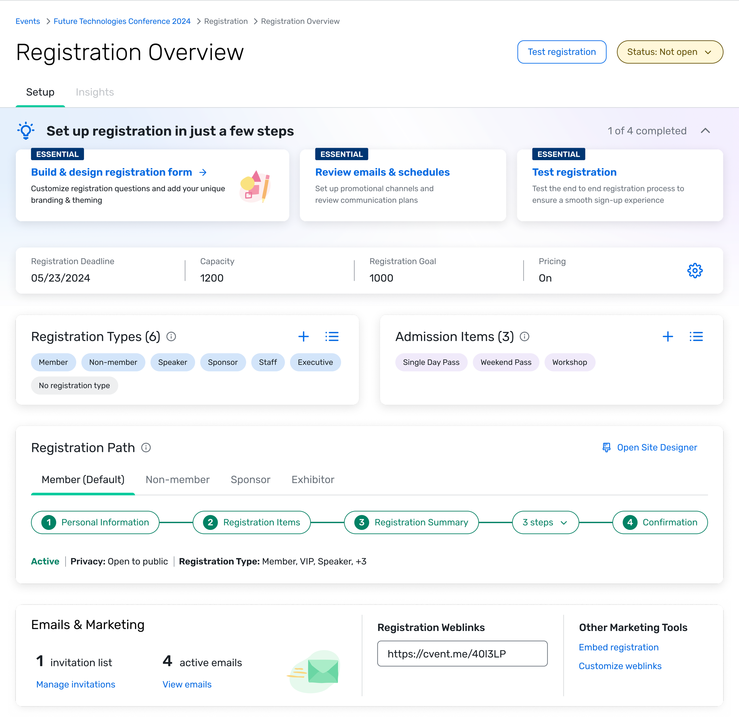
Essential setup first — The top of the overview surfaces the status of the most critical registration elements: registration type, admission items, and launch readiness. We prioritized these over secondary settings because they're the things planners need to get right before anything else, and they were the hardest to verify in the old workflow. Showing their status up front gives planners an at-a-glance understanding of where they stand and what to expect when they open registration.
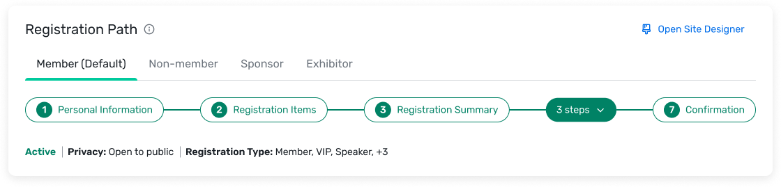
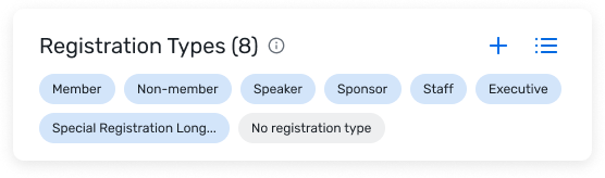
Designing for expansion — Events range from simple webinars to multi-day conferences with dozens of registration paths. Every visual component needed to scale across that spectrum without feeling cluttered for simple events or insufficient for complex ones. We designed the cards and status indicators to progressively reveal detail — a straightforward event looks clean and simple, while a complex one surfaces the additional configuration without overwhelming the layout.
Guiding users through the process — Registration setup is intimidating for first-time planners because the features and configurations aren't self-explanatory. Rather than relying on documentation or training, we built guidance cards directly into the overview that break complex decisions into simple, progressive steps. This keeps users moving forward without needing to leave the page or understand the full system before they start.
The Whole Package
Results
The redesigned registration overview launched in beta in Q3 2024 and rolled out to all users in Q4. One of our key measures was the System Usability Scale score for registration setup, which had a platform-wide target of 80. Before this project, the baseline was 69.9. During usability testing, scores ranged from 78 to 85 — a meaningful jump. Post-release, the measured score settled at 72.9: a clear improvement over the baseline, but short of the platform target.
Testing conditions are controlled; real-world usage introduces edge cases, varied event types, and workflows we hadn't fully optimized yet — particularly around pricing and private events, which we'd intentionally scoped out of v1. The results validated the direction while giving us a clear map of where to invest next.
Early design follow-ups included adding iconography to better distinguish object types and making adjustments for events using pricing, ahead of a larger pricing-focused release planned for 2025.
Learnings
Holding the line on quality. Working alongside Siqi, I saw what it looks like to be uncompromising about only shipping work you know will make the product better — even when it takes more iterations than expected, or when PMs are eager to move things to dev. That insistence on getting things right, not just getting things done, is something I've carried forward.
Content-first as a design method. I hadn't collaborated closely with content designers before this project, and the content-first approach changed how I think about early-stage design work. Starting with information hierarchy before UI kept us focused on the right problems. Since then, I've built strong working relationships with content designers, and my projects have been smoother for it.
Scoping as a skill. The decision to start with free, public events was a masterclass in scoping. Finding a size that's big enough to have meaningful impact but small enough that I can actually deliver it as an IC — and that PMs will trust me to deliver well — is something I'm still learning. Siqi navigated this really well, and watching her make those calls gave me a better framework for my own scoping decisions.
What I'd do differently. I wouldn't change much about what we released. But in hindsight, I think the strongest follow-up would have been tackling testing and previewing registration, rather than pricing and fees. The overview made setup clearer, but it's still hard for planners to know when they've truly finished the job. A preview and validation flow would have closed that loop more completely.