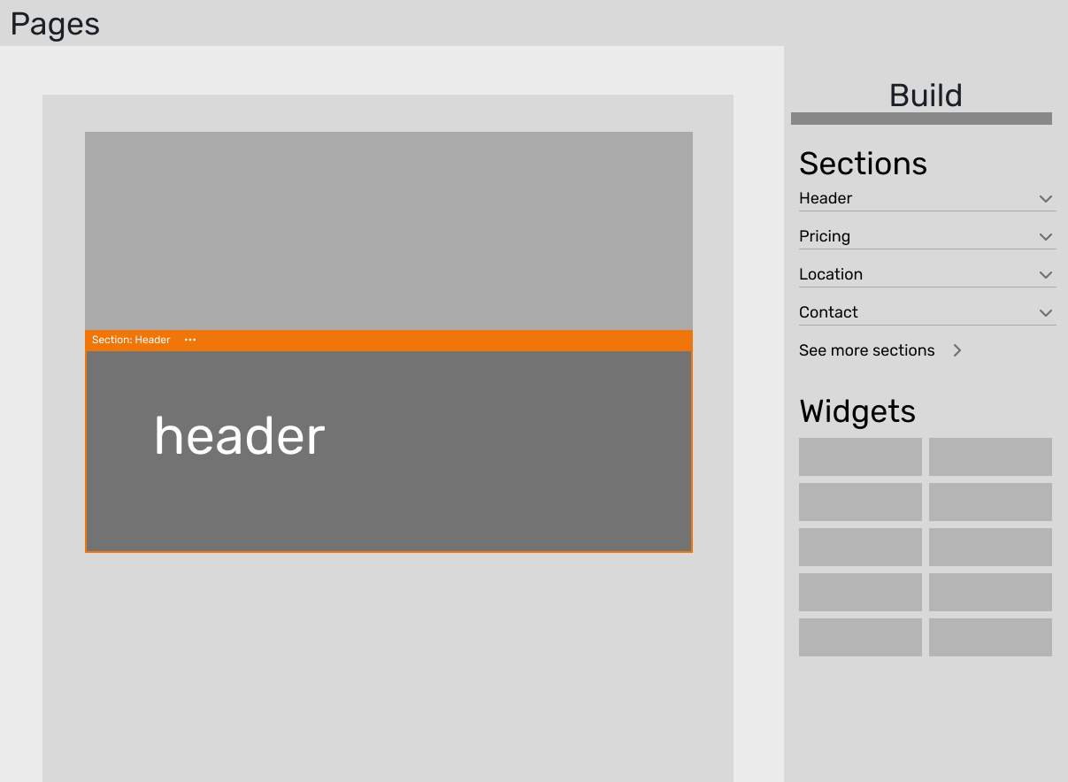
Website layouts
Cvent is an enterprise event technology platform used to plan large-scale events and conferences. The product serves a complicated ecosystem of users — event planners, marketers, attendees, and internal stakeholders — each with different goals and workflows.
I led a project to reduce Time to Value for new accounts, helping users find value faster as they build and plan events.
Context
Cvent's platform is big and complex, which is part of what makes it an interesting design challenge. Onboarding new accounts is lengthy and expensive, and with so many different user types touching the product, there's no single path to value.
To address this broad issue, I partnered with a user researcher, Alex Smith, to understand when and where new customers find value in our products. Based on our findings, we identified the event website as a great starting point for improving Time to Value because:
It is among the most used features of the event: over 90% of all events on the platform utilize a website. Thus, enhancing the website experience would impact a majority of our users.
Event planners often start working on the event website early on in a new event. Improving the website-building experience would enable us to deliver value earlier in the customer journey.
Problem
Building a quality website from scratch is challenging, tedious, and repetitive.
Creating a unique event website is a crucial, early part of the event build. Even if users have previously designed a website they liked, the only way to retrieve it is by duplicating the entire event. After copying, it still demands hours of manual effort to adapt it for the new event.
It takes a lot of manual effort to assemble a website with existing tools.

Two early explorations on scale. What’s the right size to improve the workflow?
A happy path – when the user is able to use bigger tools to make bigger changes, they can make a great website quickly & easily.
Approach
Alex and I started exploring a template-based solution: giving users pre-built starting points they could customize instead of assembling everything from scratch. The early question was about scale — would full page templates or individual section templates be more useful?
To decide, we looked at how customers were actually building their websites. The data showed that nearly half of all event websites on the platform were single-page, long-scroll designs built from many content sections. For those sites, a page-level template wouldn't add much value — users would still need to rearrange and customize most of the content. But section-level templates would be useful regardless of whether someone was building a one-page site or a multi-page site.
So we went with sections. This gave us two things at once: it made the building process faster by letting users snap larger blocks of content into place, and it raised the quality bar by giving them professionally designed starting points instead of a blank canvas.
Output
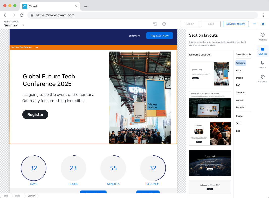
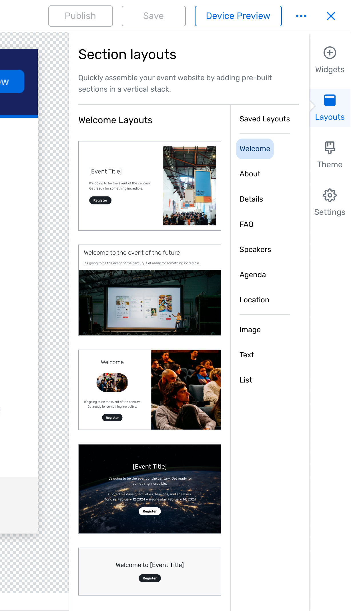
The core interaction is drag and drop — users browse a library of section layouts and drag them directly into their website canvas. I chose drag and drop over an insert-from-menu pattern because it keeps users oriented in the canvas while they build.
Users can save their own custom sections back to the library for reuse across events. The save-to-library flow was important because it turns the feature into something that gets more valuable over time — teams build up a shared library of sections tailored to their brand and event types, which compounds the time savings beyond the initial pre-built set.

Layout styles can be adjusted using theme and color controls that apply to the entire content block at once. Users need their sections to match their event branding, but letting them style individual elements one by one is tedious and prone to visual inconsistency. Block-level styling gives users meaningful creative control while keeping the quality bar high and the workflow fast
Sections are organized by communicative purpose rather than by visual style. Event planners think in terms of what they need to communicate to attendees, not in terms of layout patterns. Organizing by purpose helps them find the right starting point faster and reduces the decision fatigue of browsing a large library.
Outcome
I presented the solution to product leadership, highlighting the key workflows, demonstrating the types of pre-built layouts we could provide, and walking through a storymap detailing how this project could evolve with further investment.
After getting buy-in from leadership, I refined designs based on feedback, and fleshed out the library of layouts to offer in our v1. Right now we’re conducting research to validate some key decisions, with plans to release in Q4 2024.
To measure efficiency, we’re looking at the number of actions/commits from initialization to launch. If the layouts are truly making it easier to build a website, we expect to see fewer edits and adjustments in the building process.
To measure website quality, we’re looking at attendee data – registration funnel and bounce rates. If layouts are improving the quality of event websites, we expect that attendees will respond positively.
Update — it’s live!
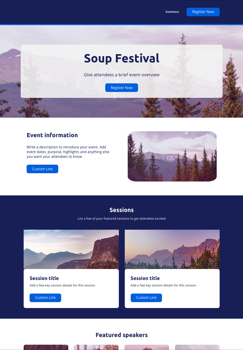
A simple website I put together in a few minutes in the live designer.
In December 2024, the sections feature was released to 10% of the user base. It received immediate and glowing feedback from users, so we progressively ramped up and released to all users over a few days.
In the proceeding weeks, we altered the designs based on user feedback (mostly navigation elements), re-organized some of the layouts, and received a green light to expand the feature by allowing users to save their own custom sections to the library.
Early adoption has been encouraging — roughly one in five users are building with layouts — and we're continuing to track efficiency metrics like the number of actions from initialization to launch, as well as quality metrics on the attendee side like registration funnel completion and bounce rates.

We replaced the sidebar navigation with a compact menu at the top of the panel to give more visual space to the layout previews. Users can browse by category from the menu or scroll through the full list — the navigation works like anchor points, jumping you to a section without hiding the rest.